Dual tone colour schemes work well in Indian living rooms because they create balance without making the space feel heavy. When chosen correctly, two colours can define zones, improve brightness, and make the room look organised. This guide explains practical dual tone ideas suitable for apartments and independent houses.
Why Dual Tone Works in Living Rooms
- It adds depth without clutter.
- Helps highlight one main wall.
- Works well for both compact and large rooms.
- Easier to maintain compared to multi-colour schemes.
- Allows furniture and décor to stand out clearly.
How to Choose Two Colours
1. Understand the Light in the Room
- Rooms with good sunlight can handle slightly darker tones.
- Low-light living rooms look better with a light + mid-tone combination.
2. Consider Furniture Colours
- Keep the wall shades neutral if you have colourful sofas.
- If furniture is simple, two contrasting wall shades can add character.
3. Select One Dominant Colour
- Use one shade for 60–70% of the walls.
- Use the second shade to highlight one feature wall or selected corners.
Practical Dual Tone Colour Combinations
1. White + Beige
- A clean and simple option for small living rooms.
- Works well with wooden furniture, cream sofas, and warm lighting.
2. Light Grey + Dusty Blue
- Gives a calm look.
- Ideal for modern living rooms with metal or light-wood furniture.
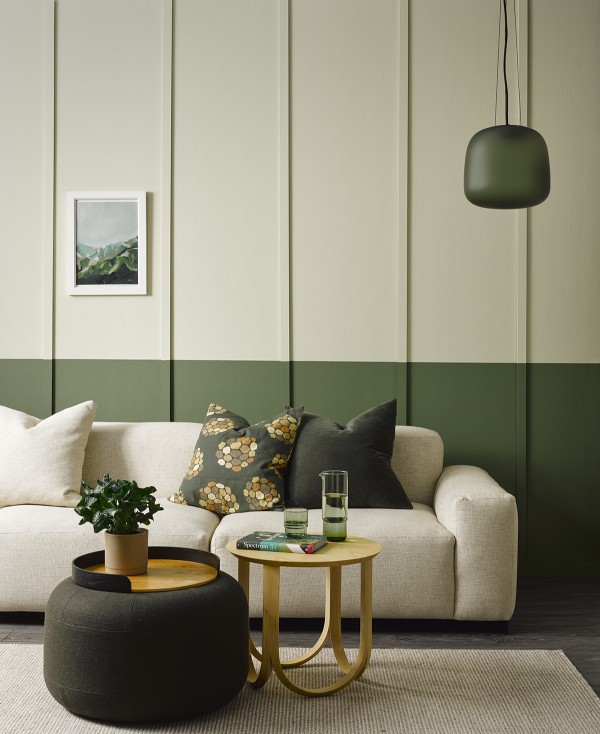
3. Cream + Olive Green
- Adds a natural, grounded feeling.
- Best for homes that prefer warm, earthy décor.
4. Soft Peach + Off-White
- Keeps the room bright and welcoming.
- Suits both traditional and modern interiors.
5. Charcoal Grey (for one wall) + Light Taupe
- Helps create a focal point without overwhelming the space.
- Works well in slightly larger living rooms.
6. Beige + Deep Brown (moderate use)
- Good for living rooms with wooden ceiling panels or storage units.
- Provides a warm and unified look.
Where to Apply Each Colour
Lighter shade:
Use on three walls, especially those facing windows.
Darker shade:
Use on a TV wall, behind the sofa, or any wall you want to highlight.
Ceiling colours:
Always keep ceilings white or very light to maintain height and brightness.
Tips to Keep Dual Tone Balanced
Avoid combining two very strong colours; it may reduce comfort.
Use matching accessories like cushions and rugs to tie the colours together.
Keep one solid focal point instead of multiple highlight areas.
Check colour samples on the wall before final selection.
Ensure the darker shade does not face the main window in compact rooms.
Maintenance Considerations
- Choose washable or semi-washable paints for easy cleaning.
- Lighter colours show marks easily, so plan furniture layout accordingly.
- Darker accent walls may need touch-ups more often in humid cities.
FAQs
Q1. Is dual tone suitable for small living rooms?
Yes. A light base colour with a mild accent shade helps the room feel open.
Q2. Which combination is easiest to maintain?
Light beige + taupe or grey + off-white stay clean for longer compared to pure white combinations.
Q3. Can I use textured paint in dual tone?
Yes, but limit textures to one wall to avoid visual clutter.
Final Guidance
Dual tone colours work best when the shades feel balanced and natural. Instead of choosing colours only for appearance, consider sunlight, furniture, and long-term maintenance. A simple, thoughtful combination often gives the most comfortable result.